
Flexbox
Introducing Flexbox
- The Flexbox (Flexible Box) CSS module offers an efficient way to lay out columns or rows within a container element, even in cases when the column / row size is not specified or changes. This is why "flex" is part of the name.
- The container element can expand its child elements to fill available free space, or reduce their sizing to prevent overflow.
- In the bigger picture of web development, Flexbox is one-dimensional (although wrapping across rows and columns can be allowed), while Grid is two-dimensional.
- Compared to floats, flexbox reduces the amount of time spent figuring out (and changing) the margins between elements.
- This is not to say that using flexbox is a perfect approach. You may find that it is not rendering elements in the desired fashion, and ultimately you're going to be writing media queries to get the desired rendering on smaller screens because the CSS still needs to change.
- Flexbox also offers a nice way to vertically center content. Prior to flexbox, there were plenty of options for horizontal centering (from
text-align: centerfor inline content to left/right auto margins on block elements that had an assigned width), but vertical centering outside of a table cell (usingvertical-align: middle) was complicated and inflexible, or very limited as to when you could do it. In other words, prior to flexbox vertical centering was usually headache-inducing.
Coding Flexboxes
- The two core concepts when coding with flexbox are:
- Flex Container: This is the element that is instructed to either:
display: flex;
or
display: inline-flex;
- Flex Items: These are the child elements of the flex container. So these are nested one level down from the parent element. Anything further down (nested deeper) is a descendant, not a child.
- Flex Container: This is the element that is instructed to either:
- Your HTML code structure is very important. The columns / rows are the children, not the descendants, so you must make sure that you have your code hierarchy correct. If you randomly start adding markup, you can inadvertently add more columns / rows.
- You can nest flex containers (in which case a flex item also becomes a nested flex container), but often you can accomplish the desired layout without doing that.
- There are specific CSS properties that are applied to the flex container, and other properties are applied to the flex items.
Properties for the Flex Container
| Property | Description | Values | Notes |
|---|---|---|---|
| display | This is what determines whether the element is a flex container or not. |
|
If this property is not set, then the other flexbox-related properties will not work. |
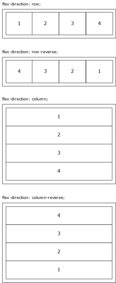
| flex-direction | This determines whether you are flowing things horizontally (in columns) or vertically (in rows within a column). |
|
The default is row, which sequences the flex items horizontally.
The The CSS rendering engine also pays attention to the
|
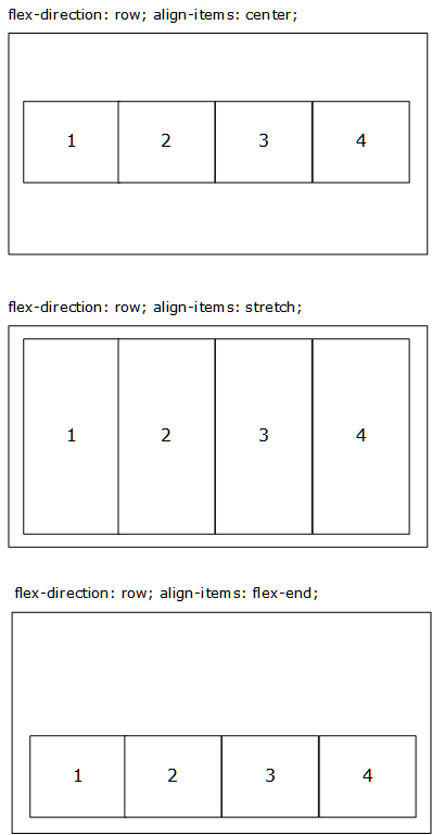
| align-items | This controls the vertical alignment of the flex item children. |
|
Defaults to stretch.
The |
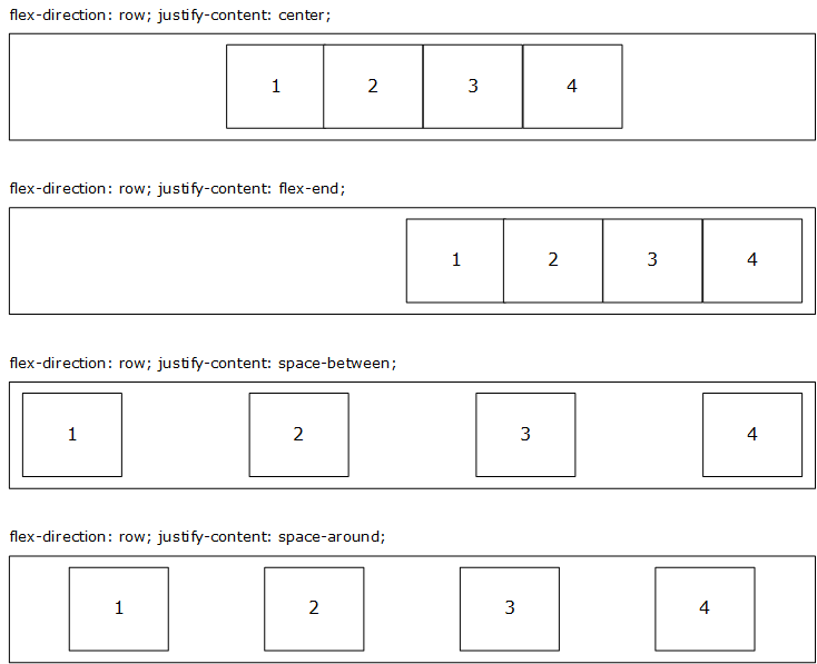
| justify-content | This controls the horizontal alignment of the flex item children. |
|
flex-start is the default. |
| flex-wrap | This determines whether the flex item children remain single-row / single-column or can become multi-row / multi-column. |
|
nowrap is the default.
Switching to |
| flex-flow | This is a shorthand property, allowing flex-direction and flex-wrap to be specified. |
Space-separated flex-direction and flex-wrap (e.g., row wrap)
|
See the flex-direction and flex-wrap property details in this article for values.
flex-direction comes before flex-wrap. |
| gap / row-gap / column-gap |
gap is the shorthand property, allowing both row-gap and column-gap to be set as space-separated values (e.g., gap: 20px 30px). The first value is row-gap and the second is column-gap. If only one value is passed, it is used for both row-gap and column-gap. |
|
If there is padding or margin on a relevant side of the flex item, that will also be used (the total space will be padding + margin + gap amount). To avoid issues from that extra box model space, switching to the alternate box model via box-sizing: border-box is recommended (so that padding subtracts from width). Disabling left/right margins (setting them to 0) is also a good idea.
The gap, row-gap, and column-gap properties are also used in grid and other multi-column contexts. |
flex-direction Visual Example
align-items Visual Example
justify-content Visual Example
Properties for the Flex Items
Note: In practice, you may not need to apply these flex item properties. All the flexbox styling can often be handled at the flex container level.
| Property | Description | Values | Notes |
|---|---|---|---|
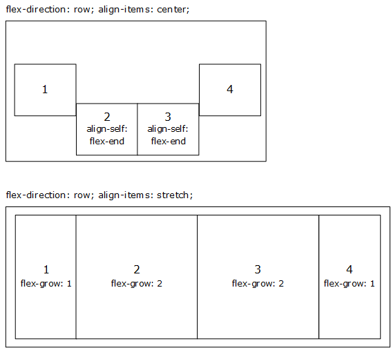
| align-self | This is the same as align-items, but at the child element level. It overrides whatever it set at the flex container level (or, if nothing is set, the flex container default). |
|
If you need a flex item to align differently than the parent element's align-items, then this is what you need to use.
|
| flex-grow | This defines the ability for a flex item to grow, if necessary. It accepts a unitless value that serves as a proportion. This dictates what amount of the available space inside the flex container the item should take up.
If all flex items have |
|
The default value is 0.
Negative numbers are not valid. |
| flex-shrink | This defines the ability for a flex item to shrink, if necessary. It accepts a unitless value that serves as a proportion. This dictates what amount of the available space inside the flex container the item should take up.
If all flex items have |
|
The default value is 1.
Negative numbers are not valid. |
| flex-basis | This defines the default size of an element before the remaining space is distributed. |
|
auto (the default) sizes based on the element's width or height and then adds extra space based on the flex-grow setting. A setting of 0 does not add extra space, and a pixel value is used as the flex item's width or height (depending on the flex direction).
Although not often used, there are additional flex-basis sizing options available |
| order | By default, flex items are rendered in the source order. This property sets the order in which they appear in their container, so it overrides that default ordering. |
|
This gives us some of the flexibility of absolute positioning, by not having to always follow the normal flow (source code order). |
| flex | Shorthand property for flex-grow, flex-shrink and flex-basis. | See the flex-grow, flex-shrink and flex-basis property details in this article for values. | The second and third parameters (flex-shrink, flex-basis) are optional. Default is 0 1 auto. |
Visual Example
Code Example
See the Pen Flexbox by Jason Withrow (@jwithrow) on CodePen.